Accessibility Improvements & Migration
PROJECT TYPE
Digital transformation
CLIENT
Merrill Wealth Technology
MY ROLE
Lead UX Designer

PROBLEM STATEMENT
The Merrill development team needed UX support to migrate their suite of applications to Angular. The goals were to modernize the interface, resolve accessibility issues, and bring all screens into alignment with Bank of America's Helix Design System. The project came with a short turnaround time and limited access to end users for direct feedback.
FUNCTIONAL DECOMPOSITION
o kick off the migration effort, I led a functional decomposition of the legacy application—an essential first step in understanding the complexity and limitations of the existing system. This process involved breaking down every core workflow, interface component, and user action into modular units. By mapping out how each part of the application interacted with others, I was able to uncover unnecessary redundancies, pinpoint inconsistencies in logic or design, and identify outdated patterns that no longer served users effectively.

HEURISTIC ANALYSIS
From there, I conducted a heuristic analysis, evaluating screens for usability, consistency, feedback, and error prevention. This surfaced pain points like disjointed navigation and unclear calls to action, giving us a roadmap for improvement.

DESIGN GOALS
-
Ensure visual and functional consistency across all screens using the Helix Design System.
-
Streamline legacy workflows to reduce cognitive load and improve task efficiency by at least 25%.
-
Modularize components for reusability and easier development handoff.
-
Improve navigation clarity by addressing heuristic issues and aligning with user expectations.
-
Support scalable architecture through UI patterns optimized for Angular’s component-based structure.
-
Achieve WCAG 2.2 compliance to enhance accessibility for all users.
-
Accelerate design-to-dev handoff despite limited access to users and short timelines.
-
Enable faster usability testing through lean wireframes and iterative validation.
UX DESIGN
Lo-fi Wireframes
To validate the restructured workflows and surface usability issues early, I developed a series of low-fidelity mockups. These wireframes concentrated on layout, user flow, and content hierarchy—intentionally minimal to keep the focus on structure rather than visual polish.
Through multiple rounds of iteration, we refined the designs based on internal feedback and shifting requirements. This approach not only clarified complex task flows but also accelerated stakeholder alignment—crucial given the tight timeline and limited access to end users.


High-fidelity Designs
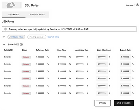
With the core flows approved, I transitioned into high-fidelity design, applying the bank’s established UI standards to ensure visual consistency and brand alignment. Each screen was refined to enhance clarity, coherence, and overall usability across the application.

To meet accessibility standards, I led a formal WCAG 2.2 review process. This involved fine-tuning elements like color contrast, focus indicators, and labeling. The result was a polished, inclusive interface that was both compliant and ready for handoff to development.
OUTCOMES & IMPACT
What changed once the system went live:
-
↓Reduced training needs by 80% due to more intuitive workflows
-
Accelerated development handoff with production-ready, accessible designs
-
Ensured 100% WCAG 2.2 compliance after formal accessibility review
-
Streamlined task flows, cutting average completion time by 40%
-
↑Increased internal stakeholder alignment through early wireframe iteration
-
Achieved seamless integration with the bank’s broader enterprise systems
-
Enhanced overall usability by resolving key heuristic issues
-
Strengthened security alignment with the bank’s risk model requirements
CONCLUSION
Migrating Merrill’s legacy applications to Angular was more than a technical upgrade—it was an opportunity to reimagine and simplify critical workflows for both users and developers. Despite constraints like limited access to end users and a tight timeline, we delivered a cleaner, more intuitive experience by focusing on foundational UX strategy, rapid iteration, and close alignment with development teams. Each decision, from system decomposition to accessibility validation, was grounded in creating lasting value across the product’s lifecycle.
The project not only modernized the interface but also minimized training needs and improved task clarity across the suite. By producing fully annotated, production-ready assets, we accelerated engineering velocity and helped integrate accessibility and design consistency into the team’s long-term roadmap. This migration set the stage for continued enhancements while reinforcing the importance of thoughtful UX in enterprise-scale transformations.